The color of your villa helps set the mood in each room, making spaces feel calm, bright, warm, or welcoming depending on the choices you make. Whether you’re going for a bold look or something more subtle, the right color scheme brings everything together in a clean, organized way.
In Dubai, the natural light is stronger and more direct than in many other places, which can change how colors look throughout the day. A soft beige might seem almost white in the afternoon sun, while darker tones can feel heavier than expected.
That’s why it’s important to test colors in your own space and see how they look throughout the day. In this blog, we’ll walk through how to choose an interior design color scheme that works well with your villa, lifestyle, and the Dubai environment.
Understanding Interior Design Color Schemes
Before choosing paint or furniture, it’s helpful to understand how color schemes work. A well-thought-out color scheme brings harmony to a space and helps avoid mismatched or unbalanced interiors. There are three common color schemes used in villa design: monochromatic, analogous, and complementary.
Each one creates a different visual effect and serves a unique purpose depending on the mood, lighting, and layout of your villa.
Monochromatic Color Schemes
A monochromatic scheme uses variations of a single color, different tones, tints, or shades, to create a calm, cohesive look. This approach works well for minimalist or modern interiors and is especially effective in homes that get a lot of natural light.
- Uses one base color in varying lightness or darkness
- Creates a clean and unified appearance
- Easy to pair with natural materials like wood, stone, or linen
Analogous Color Schemes
An analogous scheme uses colors that are adjacent on the color wheel, such as blue, blue-green, and green. This style offers more variety than monochromatic but still feels balanced and easy on the eyes.
- Includes 2–3 neighboring colors from the color wheel
- Feels natural, soft, and harmonious
- Works well for open-plan villas where you want a smooth transition between spaces
Complementary Color Schemes
A complementary scheme pairs two colors from opposite sides of the color wheel, such as blue and orange or green and red. This creates high contrast and visual energy.
- High contrast, bold, and more dynamic
- Adds personality and drama when used in the right balance
- Ideal for statement walls, feature furniture, or artwork
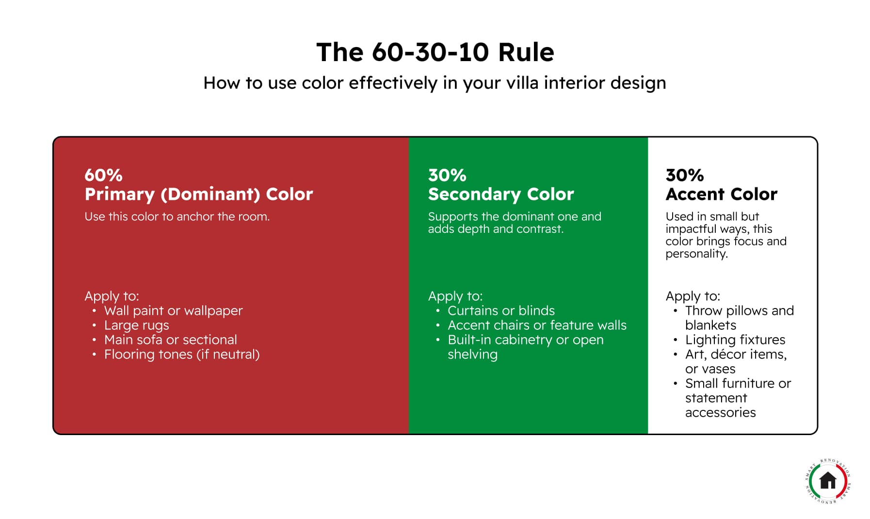
Applying the 60-30-10 Rule in Your Villa’s Interior Design
Once you’ve chosen your color scheme, whether it’s monochromatic, analogous, or complementary, the next step is figuring out how much of each color to use. The 60-30-10 rule is a simple yet effective guideline for creating a balanced, visually pleasing space. It divides the use of color into three parts:
- 60% – Dominant color (main background)
- 30% – Secondary color (supporting elements)
- 10% – Accent color (highlights and pops of interest)
This proportion ensures that one color anchors the space, a second one adds variety, and a third brings contrast and energy without overwhelming the room.
60%: Dominant Color
The dominant color sets the tone and serves as the room’s base. It covers the largest surfaces and gives the space its overall character.
Common applications:
- Walls (paint or wallpaper)
- Large area rugs
- Main sofa or sectional
- Flooring or ceiling tones (if neutral)
Examples:
- Soft beige or warm white on walls to reflect natural sunlight
- Light gray sofas or large neutral rugs to create a calm, airy feel
- Sand-toned tile or wood-look flooring to match the desert palette
Choose a neutral or subtle color here, especially for larger spaces with open layouts. It allows other elements to stand out without clashing.
30%: Secondary Color
The secondary color supports the dominant tone and brings visual interest. It’s different enough to create contrast, but still in harmony with the main color.
Common applications:
- Curtains and drapes
- Armchairs or lounge chairs
- Feature walls or wall panels
- Cabinetry or built-ins
Examples:
- Dusty olive or charcoal gray curtains to contrast light walls
- A navy accent wall behind the bed or TV area
- Rich wood tones in shelving or cabinetry that balance lighter furniture
This is a good place to introduce texture or material contrast (e.g., wood, metal, velvet) to break up large areas of flat color.
10%: Accent Color
The accent color is used in small touches to bring the space to life. It grabs attention, creates focal points, and reflects personal style.
Common applications:
- Throw pillows, blankets.
- Artwork, sculptures, and vases
- Lampshades or lighting fixtures
- Decorative accessories or small furniture items
Examples:
- Terracotta or gold in cushions and wall art
- Deep teal or rust in vases or side tables
- Metallic finishes (brushed brass or matte black) in light fixtures
Use the accent color sparingly but purposefully. A few carefully placed pieces can make the space feel dynamic without overwhelming the design.

Choosing Colors Room by Room
Different rooms serve different purposes, so your color choices should reflect how each space is used. Some areas call for calm, others for energy or warmth. Below is a room-by-room guide to help you apply your color scheme effectively throughout your villa.
Living Room
The living room is where people gather, so it should feel welcoming and comfortable.
- Use neutral or warm tones (like beige, cream, taupe) as a base to reflect Dubai’s natural light.
- Add earthy secondary tones like terracotta, olive green, or navy to create contrast.
- Accent with textured cushions, artwork, or throws in bolder colors like rust, gold, or deep blue.
Example palette: Warm white walls, soft gray sofa, burnt orange accents.
Kitchen
The kitchen is often busy and bustling. Color here should feel clean, fresh, and energizing.
- Stick to light base colors such as white, pale gray, or soft beige to keep the space open and bright.
- Use muted greens, dusty blues, or even warm wood tones for cabinetry or backsplashes.
- Accent with small decor items or lighting in metallic finishes like brass or matte black.
Example palette: Off-white walls, sage-green cabinets, brushed-gold handles.
Dining Room
This space should feel a bit more dramatic or elegant, especially if used for hosting.
- Choose deeper tones like navy, charcoal, or forest green for a more intimate, cozy feel.
- Balance with neutral or warm secondary tones like wood finishes or cream-colored trim.
- Use metallic or rich-colored accents in lighting, table settings, or artwork.
Example palette: Deep blue wall, walnut dining table, gold-framed mirror.
Bedrooms
Bedrooms should feel calm and restful, offering a break from the busy day-to-day.
- Use soft, cool tones like pastel blue, dusty lavender, or muted green as your dominant color.
- Pair with warm neutrals (beige, ivory, soft gray) for furniture or curtains.
- Keep accents simple and personal, such as framed photos or subtle patterns in bed linens.
Example palette: Pale gray walls, light wood bed frame, soft green cushions.
Bathrooms
A bathroom should feel fresh, clean, and uncluttered, with a relaxing atmosphere.
Color tips:
- Stick with cool tones like light blue, seafoam green, or soft gray for a spa-like effect.
- Use white or off-white fixtures to keep the space looking crisp and bright.
- Add contrast through towels, small tiles, or mirrors with a darker or metallic frame.
Example palette: Light gray walls, white tiles, black mirror frame.
Home Office
This space should feel focused but not cold. Color can help you stay productive without feeling boxed in.
- Choose muted tones like soft blue, sage green, or warm gray as a calming backdrop.
- Introduce a contrasting secondary color through shelves, seating, or wall panels.
- Accent with inspiring décor or functional pieces in warmer or brighter shades.
Example palette: Sage-green wall, light-wood desk, mustard-yellow chair.

Creating a Cohesive Color Story Across the Villa
In large villas, especially those with open layouts or multiple levels, colors shouldn’t feel random or disconnected from one room to the next. A cohesive color story helps tie everything together, making the entire home feel balanced, intentional, and well-designed.
Start with a Core Palette
Choose a base color palette of three to five colors that you’ll use throughout your villa. These should include:
- One or two dominant neutrals (like warm white, beige, or gray)
- A secondary or accent shade (such as navy, olive, or terracotta)
- A bold accent (used sparingly, mustard, rust, deep green, etc.)
This core palette becomes your guide when selecting paints, finishes, fabrics, and furnishings. You won’t use all colors in every room, but they should repeat in different ways across different spaces.
Shift the Balance Room by Room
You can create variation by changing how the colors are used from one space to another:
- A dominant color in one room might become a secondary or accent in another.
- For example, soft gray might be the wall color in the living room, but only appear as a rug or side table color in the bedroom.
- A bold accent like emerald green used in the dining room chairs can reappear subtly in bedroom cushions or bathroom accessories.
This approach builds consistency without monotony.
Use Fixed Elements as Anchors
Certain features remain the same throughout the home, such as flooring, window frames, and metal finishes. Use these elements as anchors to ground the color story.
Examples:
- Warm oak floors throughout the villa pair well with soft earth tones and matte black hardware.
- Consistent metal finishes, such as brushed brass or matte black, in fixtures (lights, handles, taps) create continuity.
- Neutral base wall color across hallways or shared spaces helps transition between bolder rooms.
Repeat Materials and Textures
Beyond color, repeating certain materials and textures across rooms supports visual flow:
- Use similar fabric types (like linen or velvet) in different shades.
- Carry over wood finishes (light, dark, or mid-tone) in furniture across spaces.
- Stick to one or two tile styles in wet areas for consistency.
Even if the colors vary, these shared materials help maintain unity.
Mind the Transitions
In open-plan villas, it’s important to manage transitions between spaces without sharp breaks. Where rooms are visible from one another:
- Keep walls in related tones or shades.
- Avoid overly high-contrast color jumps.
- Use shared elements, such as matching curtains, rugs, or artwork styles, to bridge the gap.
In more private spaces, like bedrooms or bathrooms, you can afford to go bolder or more personal as long as at least one element ties back to the larger palette.

Conclusion: Tips Before You Choose Your Villa Color Scheme
Choosing the right color scheme for your villa interior design in Dubai is about creating a space that reflects your lifestyle, responds to the local environment, and feels balanced from room to room.
Before finalizing your choices, here are a few tips to keep in mind:
- Test colors in natural light: Dubai’s sunlight can make colors look warmer or more intense. Always sample paints on your actual walls and observe them at different times of day.
- Build from a base palette: Start with 3–5 core colors and use them consistently throughout your home in varying amounts.
- Follow the 60-30-10 rule: This helps maintain balance, especially in open or multifunctional spaces.
- Think in layers: Use texture, material, and finish to add depth, even in a neutral scheme.
- Stay connected across rooms: Let each room have its own personality, but tie them together with recurring tones, finishes, or accents.
- Don’t rush: Take your time planning, testing, and visualizing how colors interact with furniture, lighting, and layout.
If you’re unsure where to begin, working with a professional can simplify the process. At Smart Renovation, we not only manage your renovation from start to finish, but we also help source the right furniture, art, and materials to match your chosen palette. When everything comes together under one cohesive vision, your villa doesn’t just look good, it feels like home.
Frequently Asked Questions
What colors are best suited for Dubai villas with abundant natural sunlight?
Homes in Dubai typically receive strong sunlight throughout the day, which can make certain colors appear brighter than expected. To avoid colors looking too intense or washed out, it’s often better to choose muted or earthy tones. Neutral shades like beige, taupe, warm gray, and off-white perform well in daylight and keep the space balanced. For deeper hues, try dusty blue, olive green, or charcoal, which hold their color even under direct sun.
What is the 70/30 rule in interior design?
The 70/30 rule is often used to guide how much of a room should feature a primary color versus a secondary one. Typically, 70% of the space is designed using a more neutral or subtle color, while 30% introduces a contrasting or stronger shade.
Can I use dark colors in small or enclosed spaces?
Yes, dark colors can work well, even in smaller rooms, if used correctly. In areas like powder rooms, using a rich tone such as navy, forest green, or deep brown on the walls can create a cozy, dramatic effect. To prevent the space from feeling too closed-in, pair dark walls with light flooring, mirrors, or bright fixtures to reflect light. Dark tones are also effective when used selectively, like on one accent wall.
What is color theory in interior design?
Color theory in interior design concerns how colors interact and influence a space’s look and mood. It helps you understand which color combinations are likely to create a calm, vibrant, or balanced environment. Warm colors like red and orange often bring energy, while cool tones like blue and green tend to feel more relaxing.
Should my furniture and color scheme be chosen together or separately?
It’s best to plan both at the same time. The interior design color scheme should work with the materials and tones of your furniture. For example, if your furniture features warm-toned woods or leather, aim for a palette that complements them, such as soft neutrals, olive greens, or muted blues.